Logo
Rock and Pond Consulting
Rock and Pond came to us with a name, a color, and a picture in mind: rocks and a pond, in their green. Sheila drew the mark they use today.

- Scope
- Logo design
Two directions, and the one they chose
Sheila drew two directions. The first was the literal one, rocks and water rendered much as they are. The second, the one they chose, reduces the picture to a stack of three stones over a ripple, set in a circle of their green so the mark holds its shape at any size, from a favicon to the front of the website they were building at the time.
The mark launched with their site
Rock and Pond were building their own site and had a launch date a few weeks out. We delivered the mark on their deadline, handed over every file, and they launched with it.
Tell us about yours.
Request a discovery callNext project
La Santisima Gourmet Taco Shop
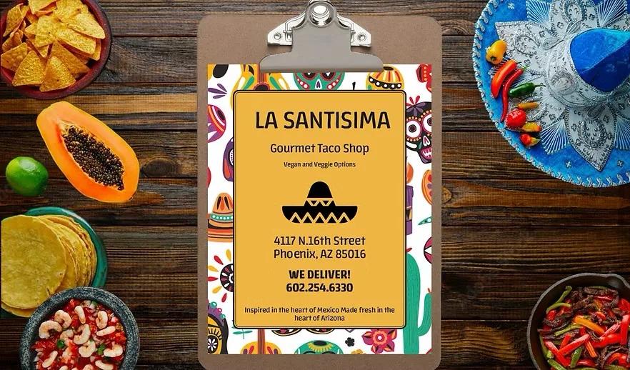
La Santisima, a taco shop in Phoenix, asked for a takeout menu and a business card that looked like the place. Sheila built both around a yellow panel, a black rule, a sombrero mark, and a border of sugar skulls and cactus.
Read the case study