Logo
Uplift Med Aesthetics
Uplift Med Aesthetics wanted an elevated look for their brand. They asked us for a logo that would carry that feeling into print and everywhere else the name appears.
- Scope
- Logo design
A mark with room to breathe
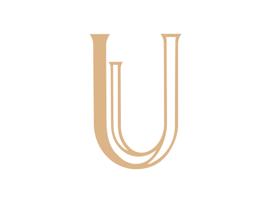
The mark is a single letter: a serif U with a second, smaller U set inside it, drawn in fine outlines in one warm tan. It is quiet on purpose. One color and clean lines mean it prints well at any size, from a business card to a sign, and still reads as the same mark.
Every file they'll need
We handed over the full file package: vector files (AI, EPS and SVG) for print and signage, and web files (PNG and JPG), each in full color and in black and white.
Tell us about yours.
Request a discovery callNext project
Bear Creek Community Church
Bear Creek's sermons play on their own site now, instead of on YouTube. The church chose the platform, and we designed and built the rest.
Read the case study